Yerkes Observa­tory

Agency: The Digital Ring · 2025

Let's talk
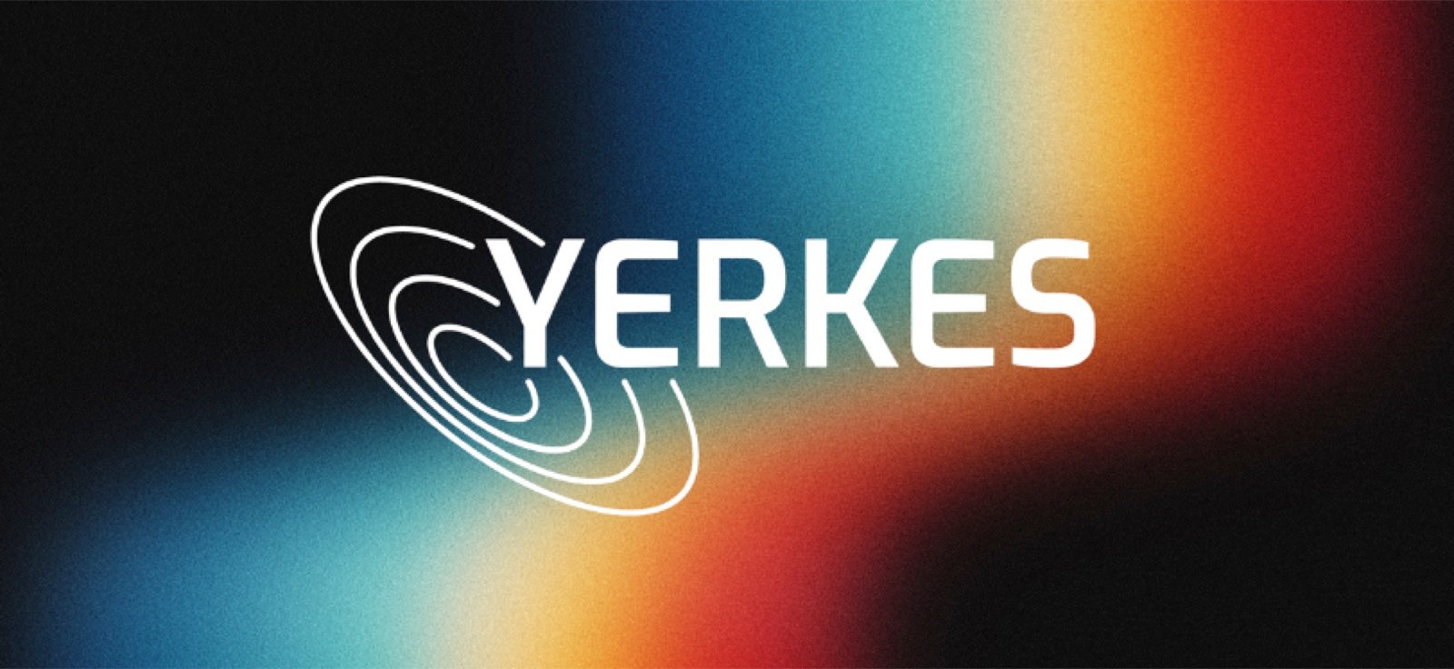
Yerkes Observatory brand identity: spiral emblem and wordmark on an aurora gradient

The Work

Yerkes is a nineteenth-century observatory with a long scientific legacy, and plenty of people nearby don't know it, or assume it's closed, only open for tours, or no longer meant for locals. The brand had to reach families, students, and weekend visitors, not just researchers, and carry its scientific weight without feeling like a museum behind glass.

Strategy

We built the brand around one thing the place already lived: the pull between rigor and wonder. Real science happens here, and so does the plain human act of looking up. The mark is a set of expanding rings, one for each of the brand's pillars, radiating out like an orbit: precise enough for an institution and open enough for a curious ten-year-old. The tagline holds the same balance: Deeply rooted. Infinitely curious.

Solution

We set the creative direction and built the brand platform, the identity, and the guidelines, including photography direction for the building, the instruments, and the sky. Then we carried the system onto a new website with events, news, and donation pages. One system for a research page and an event listing alike.

Impact

Yerkes went back out into the world with a single, coherent public face. A brand a scientist and a first-time visitor could both stand behind, ready for the next hundred years of people looking up.

The big idea

A working observatory, reintroduced without losing the science.

Got a project with a similar shape?

Tell us about it. If it looks like a fit, the first step is a free 20-minute call.

Let's talk